caracho arquitetos
architecture office / Brazil
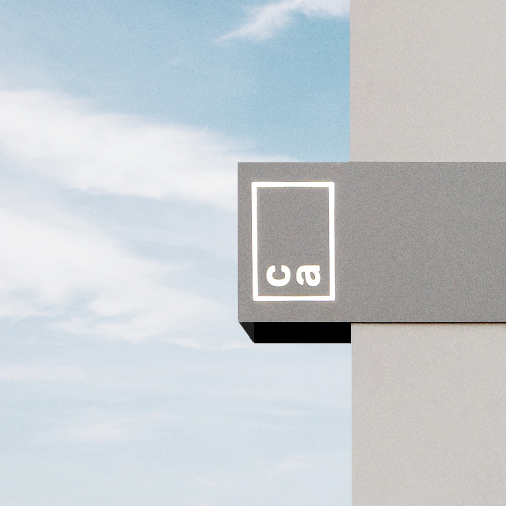
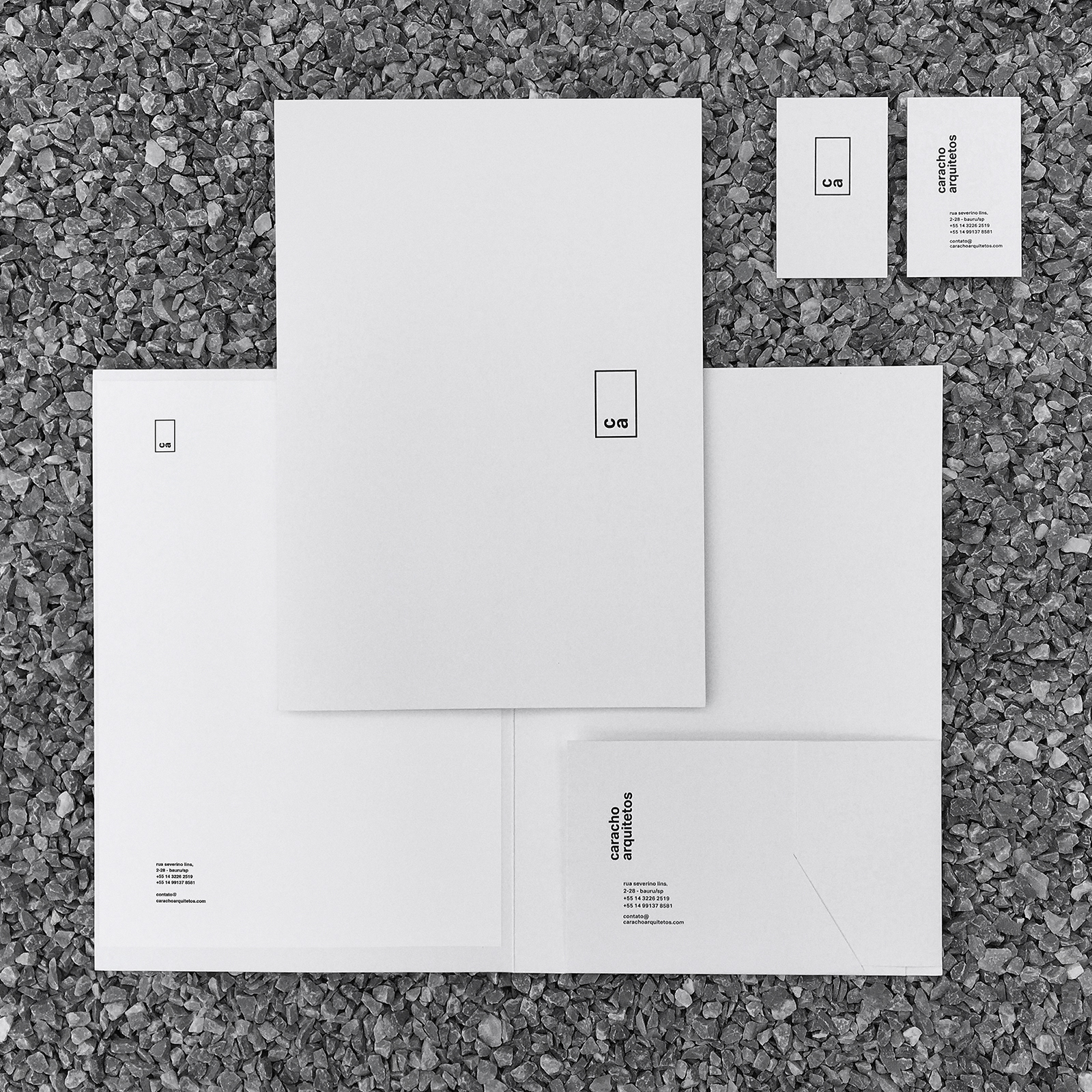
Caracho Arquitetos aimed to create a clean and timeless visual identity. The initial request was to maintain a humanist typeface in the grotesque style while developing a neutral communication approach. Additionally, they wanted to use black on white surfaces.
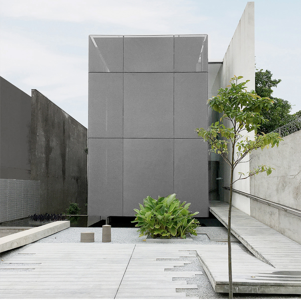
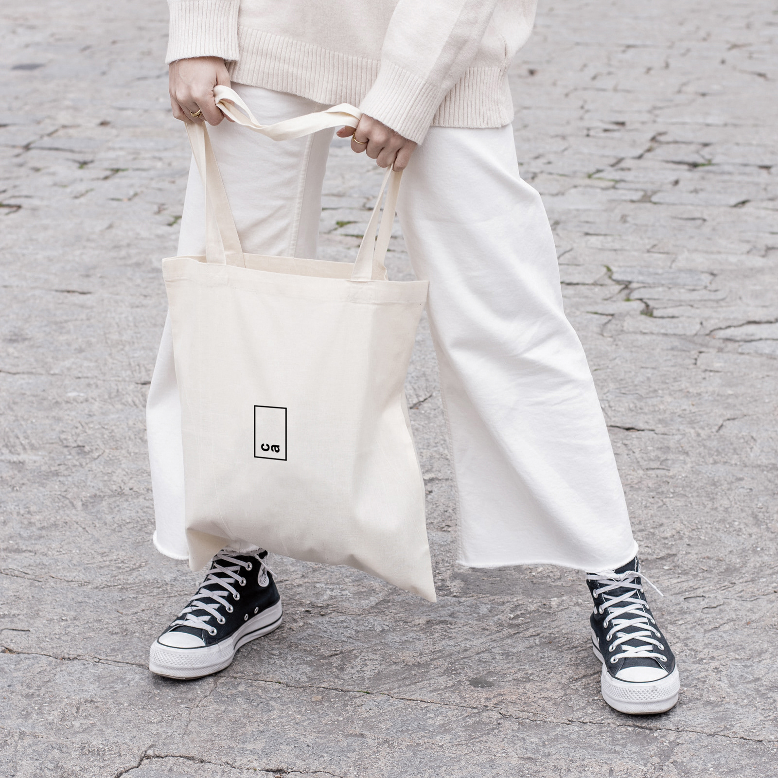
The result was inspired by the office’s architecture, which embodies a strong modern influence. A key element from this architecture—its verticality—was transformed into a symbol representing the office. This symbol reflects the building's structure, which subtly integrates from the underground to the second floor.
From a design perspective, the project draws influence from one of the leading modernist designers, Massimo Vignelli. His Book Series project for the Sansoni library in 1963 employs vertical elements, showcasing an innovative approach for its time.
The graphic design of the stationery, printed on special silkscreen paper, upholds the essentiality that the architecture studio values, emphasizing the integrity of materials through simple processes executed to a high standard of quality.
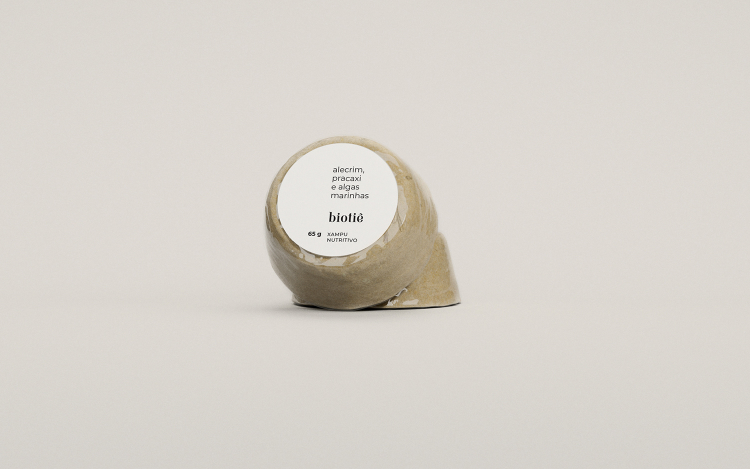
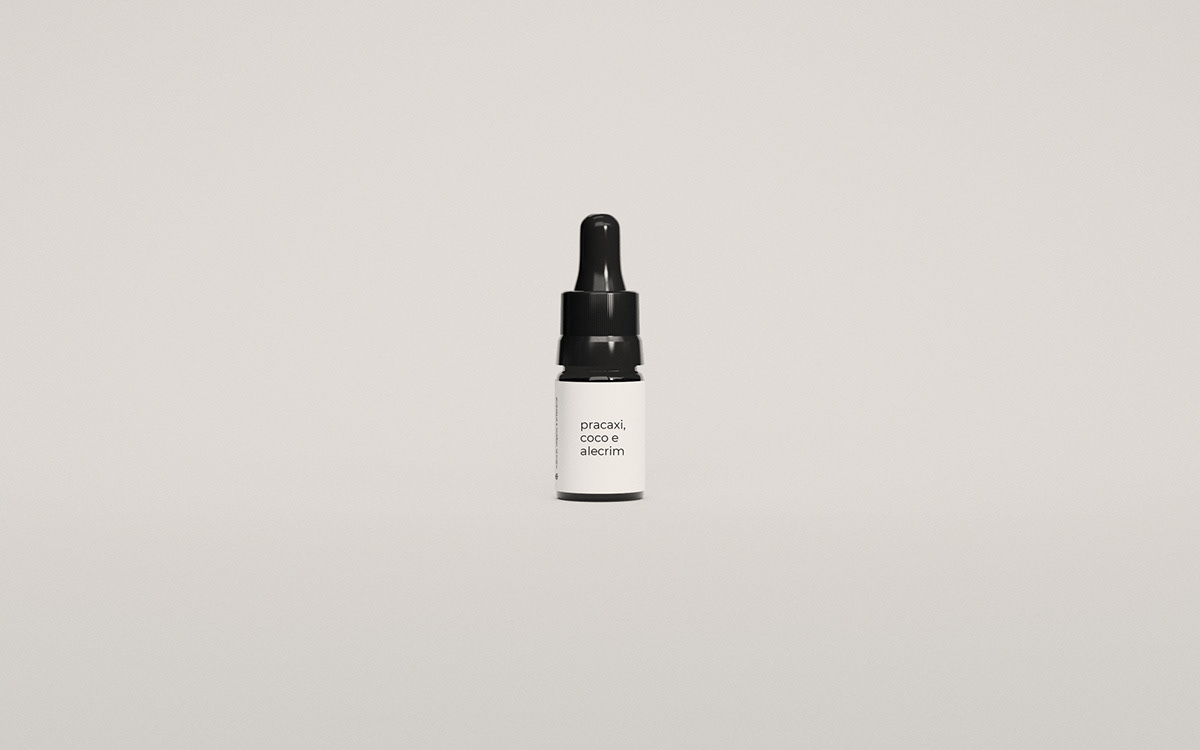
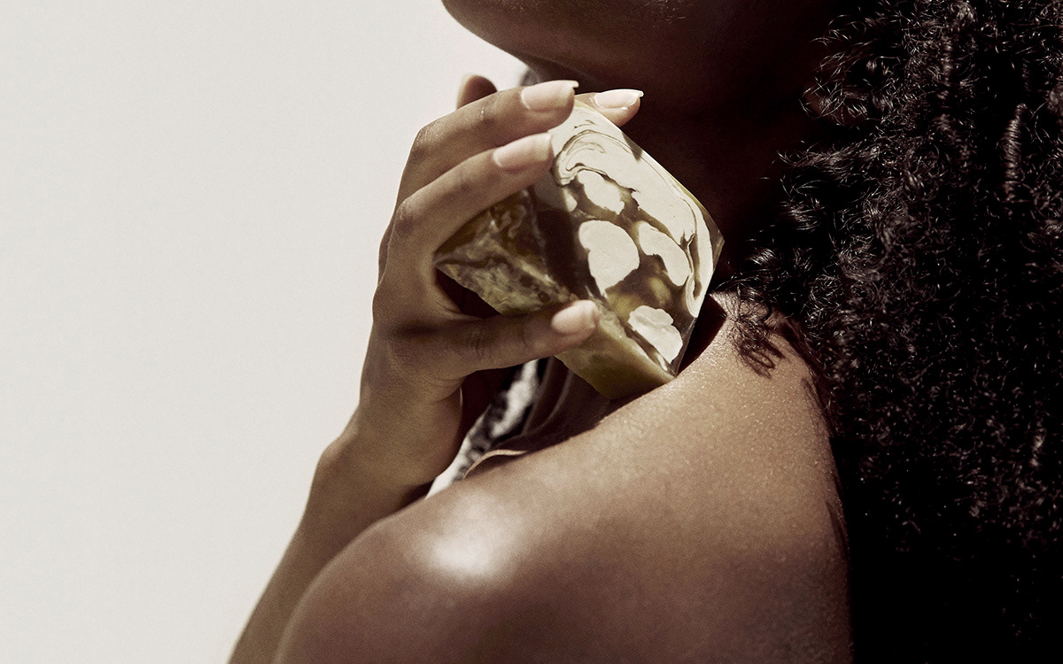
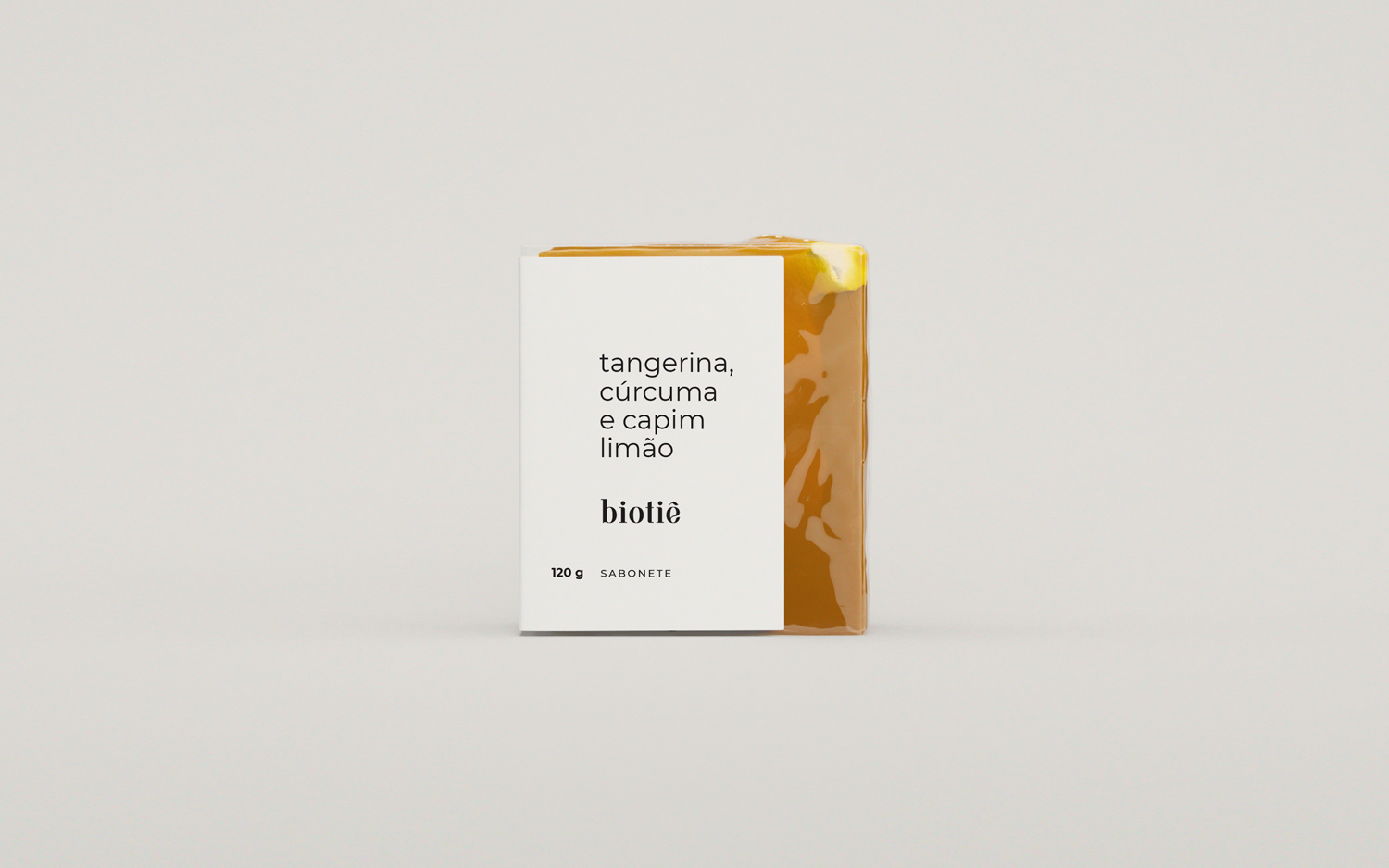
biotiê
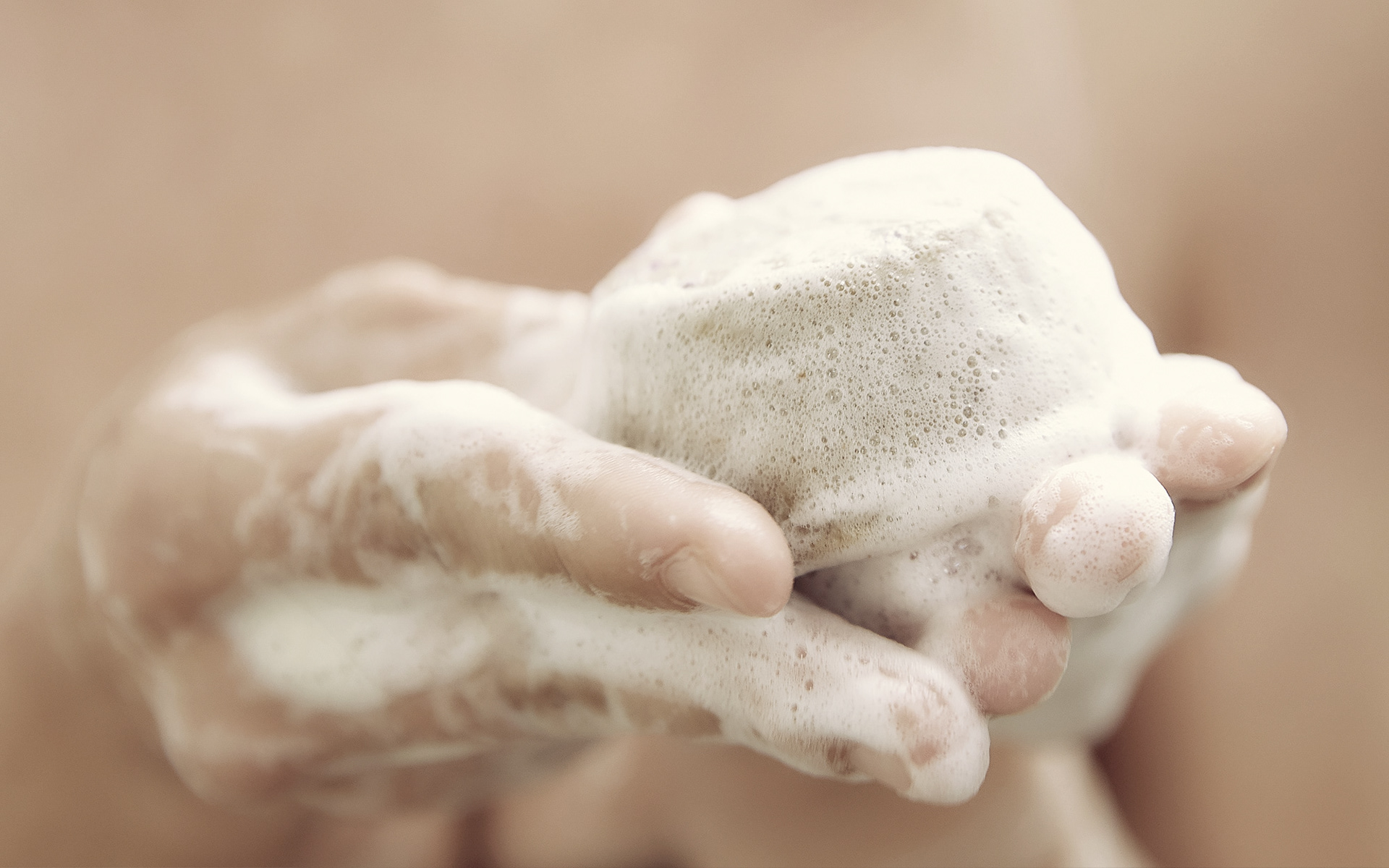
handmade soaps / Brazil
I believe in and encourage the path of simplicity—not to do less, but to do better.
For this project, we faced an extremely small budget, which led me to ask key questions that would guide our direction: Do we need packaging? To what extent are they truly necessary? Are there sustainable solutions available?
For safety, control, and adherence to regulations, packaging is still required—even if some of it may seem unnecessary. Unfortunately, sustainable options for primary packaging are limited for small companies in Brazil. Our approach was to act as responsibly as possible, using packaging preferably made from recycled materials that could be recycled again and/or reused. Whenever feasible, we aimed for 100% biodegradable options.
The main question remained: how to focus on only the essential? From this inquiry, I began the graphic design process.
The result added value to the product while remaining consistent with our goal of simplicity: we used a single type of paper and a single color for all packaging and labels. All graphic solutions were designed to minimize production costs and be 100% biodegradable.
Minimalism is not merely an aesthetic choice; it reflects values that promote longer-lasting and sustainable solutions, visually rejecting excess.
In this project, I was responsible for designing the new brand, naming the products, creating the graphic design for packaging and stationery labels, and overseeing the creative direction for photography and concepts.
iandé
handmade bag / Switzerland
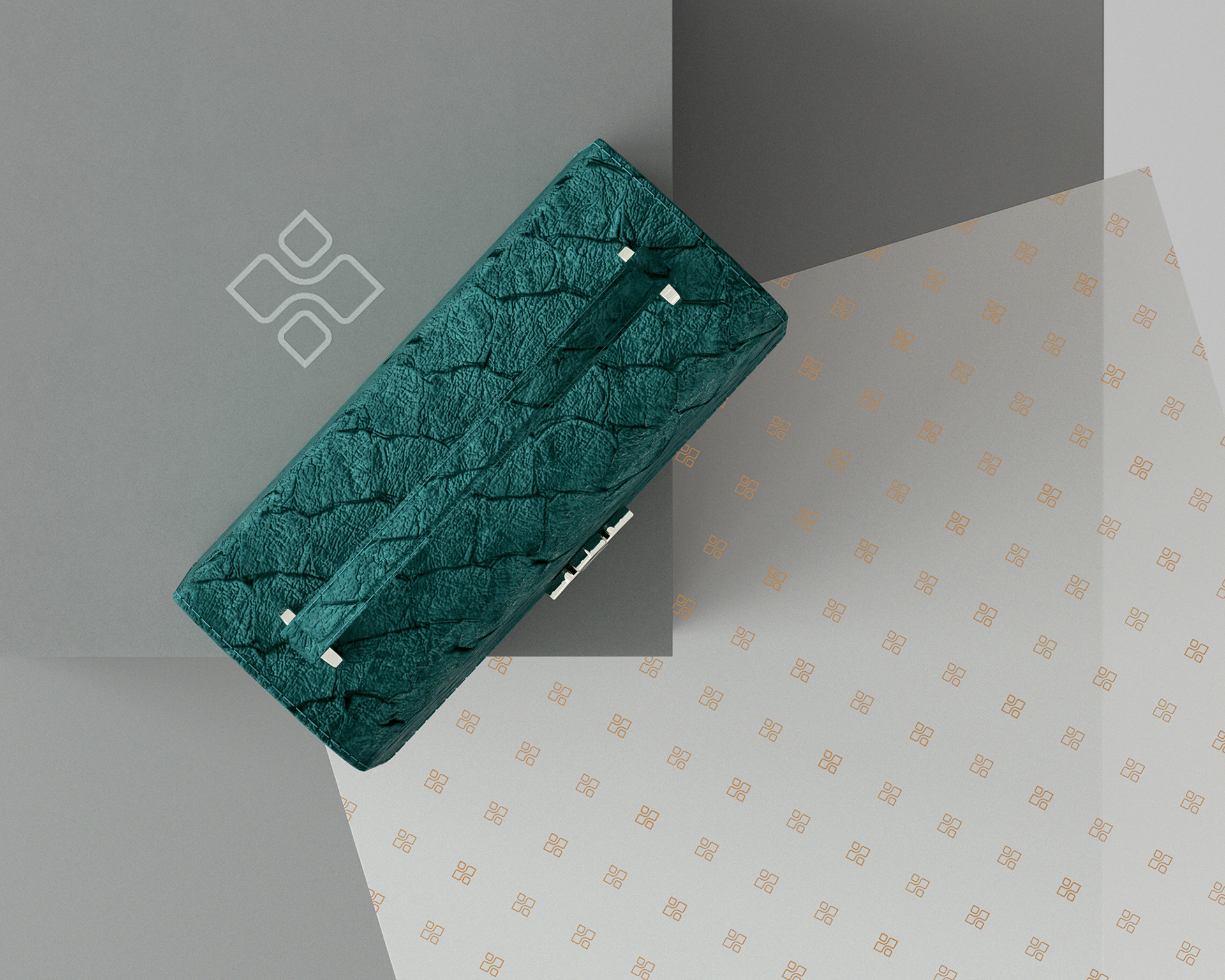
Born and raised in the Amazon, Brazilian designer Cinthya Margalho moved to Italy to specialize in Fashion Design. From this experience emerged the idea for a project aimed at engaging Amazonian communities. The iandé project, meaning “we” in Tupi-Guarani, seeks to involve not only these communities but also to honor the entire production chain by valuing both people and the environment. The handmade process begins in Brazil, travels through Italy, and culminates in Switzerland, where her bags are currently sold.
The brand creator requested the development of an icon for the bags' clasp, drawing inspiration from the project’s name and the Amazonian communities. The challenge was to create an identity that represents this rich cultural universe while also fitting into the contemporary and refined environment of Switzerland.
Neutral colors inspired by the Amazon's landscape and handicrafts, paired with clean typography, create a dialogue with the icon that balances the boldness of the product with a minimalist identity.
This project was selected for the thirteenth Brazilian Design Biennial.
other projects
Find below some images I selected from other projects.
